 A myth about long run stock market returns exists. A powerful, but maybe dangerous, myth.
That myth goes like this: Over the long run, because much of the up and down choppiness evens out, you can count on a pretty good, average-ish outcome if you’re investing for decades.
Restated another way, the myth says that if you or I can stay in the market for decades, we can probably get that nice average long run stock market return everybody seems to know about. That 6% or 7% figure. Or whatever.
Unfortunately, this myth about the reliability of long run stock market returns misleads. Long run stock market returns absolutely are not reliable. And you and I need to plan accordingly.
My Crude Line Chart of Long Run Stock Returns
Let me show you a simple line chart that visually depicts this reality. (If the image doesn’t render well, click it to display a larger version.)
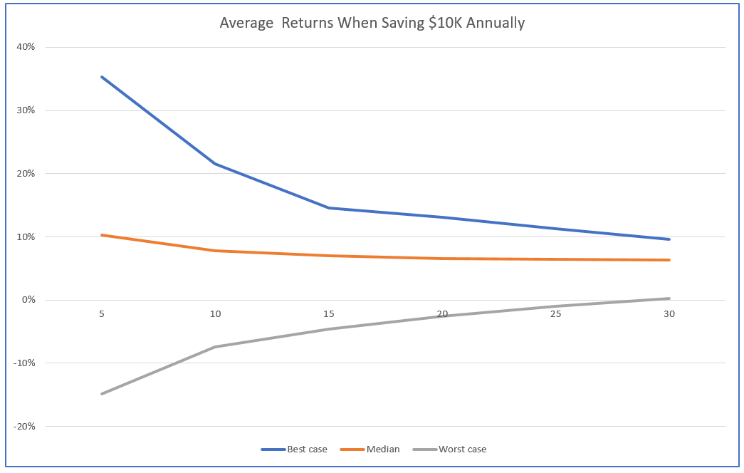
The crude little line chart shown above depicts the worst case, average, and best case returns someone saving $10,000 annually enjoyed if they saved over 5, 10, 15, 20, 25 or 30 years using a typical 75% stocks and 25% bonds portfolio.
The average return, for the record, quickly converges to around 6%. The orange line shows this value.
But here’s the thing to note: Though the range from worst to best narrows over time, results still vary widely even when you look at long run stock market returns.
At year 30, for example, the best case scenario (shown as a blue line) delivers a 10% real rate of return on your savings. And the worst case scenario (shown as a gray line) delivers no real rate of return–so zero percent–on your savings.
You see the reality, right? Sure. Maybe long run stock market returns average out to a healthy number. A typical retirement savings portfolio that emphasizes stocks maybe averages out to 6%.
But wide, wide variability in results occurs.
So here’s the point of of the post: Yes, the myth whispers you can count on average-like long run stock market returns if you just show enough patience. But history says something different. History says you better not.
How I Calculated Long Run Stock Market Returns
Let me quickly explain how I got the numbers plotted in the line chart. (If you don’t care about the math or numbers are not your friend, skip ahead to the next section.)
The data comes out of the cFIREsim online calculator, which uses a data set that starts in 1872.
The asset allocation equals 75 percent stocks and 25 percent bonds. So not 100% stocks but rather a more typical stocks and bonds blend.
The scenarios I modeled say some investor saves $10,000 annually for a given number of years: 5 years, 10 years, 15 years and so on at five year increments right up to 30 years.
I used the cFIREsim default .18% expense ratio and default annual rebalancing.
Finally, I calculated the average annual return using Microsoft Excel’s RATE function using as the function inputs that $10,000 annual savings amount, the number of years of saving, and then the cFIREsim-calculated future value for the average, best case and worst case scenarios.
And now back to the message from the chart…
Why My Tail is Fatter than Other Charts
The line chart above (and others like it) show you bear more risk than you realize.
Now I can guess you’re slightly disoriented by this statement and by the way it contrasts with what you thought. So let me try to explain the apparent differences between my cFIREsim-derived results and the information you’ve seen elsewhere.
Four factors probably explain most or all of the apparent disconnect.
First, and very frankly, you possibly just missed the reality discussed here. Regularly, authors don’t highlight the variability. Instead, they focus on the fact that the range of possible returns (that “tail”) narrows over time. This is true as the chart above shows. But the range doesn’t compress to a single value like 6%.
Note: If you’ve read and still own books written by John Bogle or Burton Malkiel, look for their charts that shown the range of returns on stocks over time. You’ll now spot the 3% or 4% or more difference between the worst case and best case returns.
Second, I’m calculating the future value of an annuity, $10,000 a year for up to 30 years. I’m not calculating the future value of an initial one-time deposit. This change from a one-time deposit to an annuity fattens the tail by nearly 70%. You do want, however, to calculate returns using an annuity since you save for retirement by making regular contributions and not a one-time deposit.
Third, some of the data people use to make the calculations and create the charts you’ve seen before don’t go back very far. To name just two examples, both the PortfolioCharts.com website and the PortfolioVisualizer’s back test asset allocation tool start their data in 1970s. That start date means they miss some really bad and some really good patches in investing. This change seems to fatten the tail by another 25% or so.
Note: Please don’t construe my statements as criticisms of the Portfolio Charts or Portfolio Visualizer websites or tools. I love both of them for what they do. But their data sets aren’t big enough to highlight what I’m talking about here.
A fourth explanation for a disconnect–at least visually: Some of line charts that show the range of long run stock market returns scrub the data of the extreme results. (Portfolio Visualizer does this, for example, showing not the worst and best cases but the 25th percentile and 75th percentile cases.) Scrubbing the data makes the line charts more usable and readable. (I’d do the same thing if I was them.) But in this particular comparison, that scrubbing hides the variability in returns.
Closing Comment
If the stuff discussed here is all new to you, you’ve got enough new stuff in your head for now. No reason to drag this on further.
Let me, though, close with this point: If this wide variability in returns is new to you, you probably have misunderstood the financial risks you’re bearing in your retirement savings program. And given that, you probably want to do some thinking about that risk and how you want to deal with it.
I’ve got some other blog posts that may help you do this:
Retirement Plan B: Why You Need One
Average Retirement Savings Return
Bogleheads Investment Philosophy Flaws: Problems with a Popular Approach
Measuring the variability by the annualized return is problematic by itself. The correct measure is the variability in the end wealth. John Norstad wrote this back in 2000.
http://www.norstad.org/finance/risk-and-time.html
The bar chart near the end shows how the range increases over time.
Great link Harry! Thank you.
I had not seen Norstad’s excellent article before.
One comment about the bar chart he displays. I actually think that bar chart understates the variability in outcomes that individuals experience because he’s calculating the future values for a single, one-time deposit rather than calculating the future values for a series of deposits like someone would do with an IRA or 401(k).
P.S. Love the finance buff blog!
Do the returns include reinvested dividends? If not this chart has missed most of the markets historical gains. Also I don’t believe returns prior to the formation of the Fed (1913) are applicable.
The returns do include include dividends on the stocks and interest on the bonds.
Regarding really early data, you may be right. But if you look at the line chart shown with the Retirement Plan B blog post (link below), you’ll note that plenty of variability exists over the whole interval where the data is available:
https://evergreensmallbusiness.com/retirement-plan-b-need-one/
“the myth says that if you or I can stay in the market for decades, we can probably get that nice average long run stock market return everybody seems to know about”
Not really a myth imo. True you might not have gotten a nice market return if you were unlucky but you would have had a return of more than 5% in most cases. Using the same cFIREsim data in 72% of the cases you would have had a return of more than 5%.
Only in 3 cases of 105 you would have had a return of less than 2%. 1891-1920, 1892-1921 and 1952-1981. Luckily for you you would probably have been fine as 1920 and 1980 marked the beginnings of 2 great bull markets.
Of course who knows what the future will bring…
I may be wrong in my perceptions of investor understanding… But I have two thoughts about this… First, I think lots of people (and a very active thread at Mr. Money Mustache reflects this), incorrectly assume if they just hold on long enough, they’ll get something close to the average of 6%. Your calculations amd my calculations show that’s not correct. People can’t use time to diversify… E.g., you note that nearly 30% earn 5% or less per your calcs. (I didn’t double-check your calculations, but those sound right.) That’s a pretty high “failure rate” or “disappointment rate”…
Second, there’s a meaningfully large difference in terms of future accumulated retirement savings and annual retirement income between getting 5% and getting 6% annually. Someone who saves $5500 into an IRA ends up with roughly $365K if they earn 5% and roughly $435K if they earn 6%. If you’re using a 4% withdrawal rate, the first investor gets roughly $14,600 a year and the second gets roughly $17,300.
That’s really my only point… Well, that and the fact that lots of people don’t really understand this variability.
P.S. In a post here, https://evergreensmallbusiness.com/average-retirement-savings-return/, I provide a table of my percentile rankings using the cFIREsim calculations. I calculated an the 20th percentile situation as an investor earning about 4.4%… calculated the 80th percentile situation as an investor earning about 7.2%.
I agree with the general premise of your post. There is a lot of variability in the outcome of your investments, even over long periods of time. To me this seems logical but maybe indeed a lot of people don’t realize this. I was just nitpicking a bit at the word “probably” in your sentence. If you would have left that out I would agree completely.
Also I thought it might be interesting to point out what, historically, the chances are of you not earning a satisfactory return. And also that even if you lived through one of the worst periods, the subsequent period would probably have been really good thanks to mean reversion as you see in 1920 and 1980.
Good points.
BTW I tried to remedy the situation a bit by doing another post that provides a better long run stock market return chart and makes some clarifications.
The stock market created $32 trillion in wealth over 90 years but more than half of that came from 86 stocks out of nearly 26,000. It is rightly said for getting the right return it is important to have the right debt and stock blend