 About a year and a half ago, a group of researchers published a study that summarized rates of return on equities, housing and bonds for 16 countries over roughly the last 150 years.
Then, a few weeks ago, the authors graciously provided the data from their study. I’ve already blogged about this wonderful resource once. (That blog post appears here: Lessons from the Rate of Return of Everything.)
But I wanted to revisit the study’s data and conclusions. And this time, to do something a little different, I’m going to plot some of the study data in line charts.
Note: The actual study appears here. (The full citation is Òscar Jordà, Katharina Knoll, Dmitry Kuvshinov, Moritz Schularick, and Alan M. Taylor. 2019. “The Rate of Return on Everything, 1870–2015.” Quarterly Journal of Economics. Forthcoming.) The data you and I can download from this web page under a Creative Commons Attribution-NonCommercial-ShareAlike 4.0 International License.
Some Explanatory Notes
Let me share a handful of upfront comments to give you some background, however.
First, each line chart shows how 1000 local currency units–dollars, francs, marks and so on–invested in a particular country’s equities, houses and bonds grow over time.
My line charts start in 1919, right after World World I, and end in 2015.
The line charts plot real values in the local currency. (I adjusted for local currency inflation, in other words.) And I use logarithmic scaling to make the graphs comparable and to let you focus on the rate of change.
Unfortunately, I could not plot a meaningful line chart for Japan or Portugal. For Japan, return data for the years after World War II aren’t available. And for Portugal, housing return data don’t become available until after World War II.
Note: Portugal’s stock market essentially melted down in the 1970s due to civil unrest, dropping in value by roughly 50% annually five straight years in a row.
The line charts here reflect geometric averages. If some country’s stock market falls by 20% one year (from a 1000 dollars to 800 dollars, say)… and then it rises by 25% the next year (from 800 dollars back to 1,000 dollars), the line charts show that as an average 0% return over the two years.
I mention this because the average returns shown in the study’s tables represent arithmetic averages. (An arithmetic average return formula looks at a -20% return in year one and then a +25% return in year two and says the average equals 2.5% per year. The actual calculation goes like this: (-20%+25%/2) equals 2.5%.) They do this, by the way, for a good reason we don’t need to get into here…
And now let’s begin… (I’ll work through the charts in alphabetical order.)
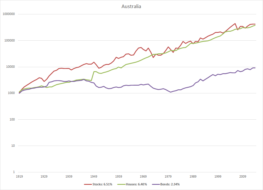
Australia Rates of Return
The Australia chart, shown first, highlights two things. First, the “stocks” red line and the “housing” green line show the premium investors earn from these risky investments. Second, the line chart shows that housing often provides smoother returns than stocks. (The green line is smoother than the red line.)
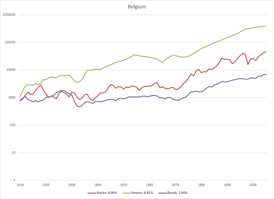
Belgium Rates of Return
The next line chart shows stock, housing and bond returns for Belgium. And it spotlights something that appears again and again in the data. Real returns on housing investments often beat real returns on stocks. (The legibility of the legend isn’t great–sorry–but it shows Belgium equities earned roughly 4.1% over last century versus housing which earned roughly 6.4% over the same time frame.)
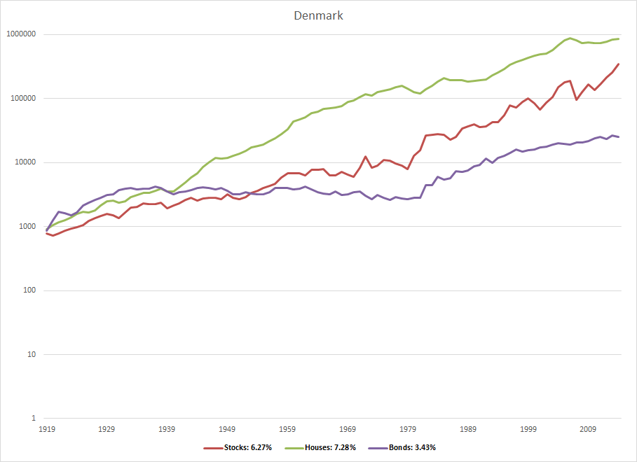
Denmark Rates of Return
Denmark’s rates of return line chart shows again the superior return delivered by housing as compared to stocks. And one interesting note… See how a small difference in the real return (6.27% for stocks versus 7.28% for housing) snowballs over time? Wow.
One thing to mention here, however: As noted in the original study, the researchers weren’t able to include the impact of property taxes in the return calculations. (They suggest that omission may reduce the real return by about 1% annually.) For Denmark, that sort of adjustment equalizes returns obviously.
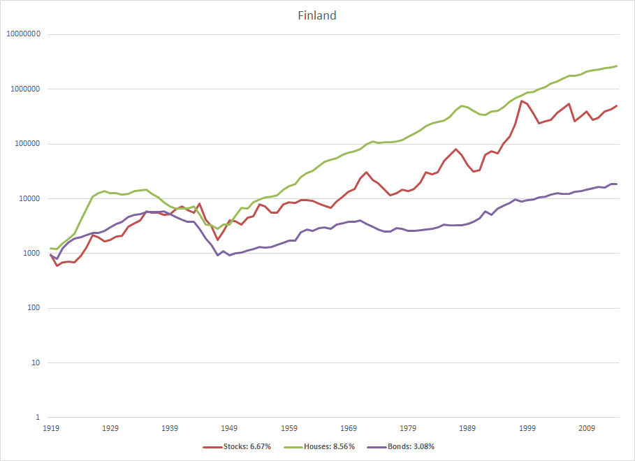
Finland Rates of Return
The Finland line chart shows again a superior return delivered by housing: 6.7% roughly for stocks versus 8.6% roughly for housing. But you wonder about the interplay of Finland’s small size (roughly 5.5 million people) and then the giant global successes of Nokia.
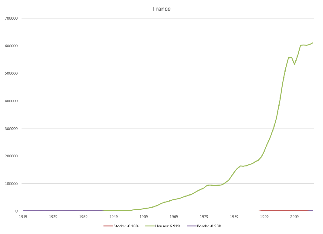
France Rates of Return
The France line chart tells an important story. You can lose money in the stock market–even if you invest for a long, long time. Over 96 years, the real return on French equities equals -.18% annually. That’s minus .18%. Roughly, a 2/10ths of a percent negative return, annually, for nearly a century.

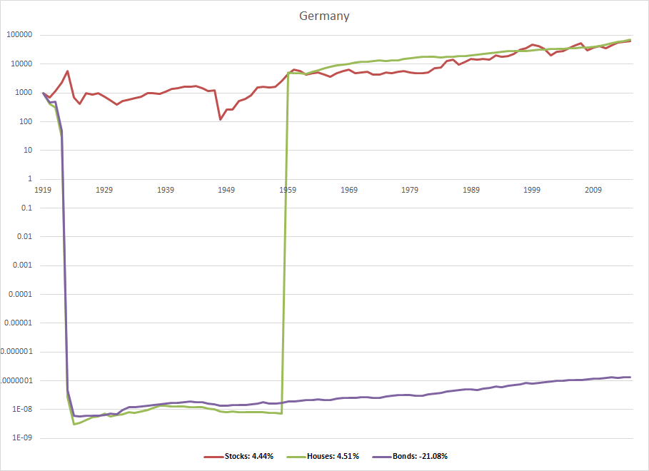
Germany Rates of Return
The Germany line chart tells two important if predictable stories. First, hyperinflation, like that experienced by the Weimar Republic after World War I, destroys bond returns. The average annual real geometric return on German bonds equals -21.08% (minus 21%) annually over roughly the last century. (Wikipedia has a good write-up here.)
Note: If this sounds impossible, note that if 1000 German marks in 1919 lose 99.999% of their value through inflation, thereby dropping in value to a penny, even a hundred years of solid bond interest doesn’t begin to rebuild the balance.
A second predictable story: War destroys returns. (This same story shows in Japan’s returns for the post-war years.)
Italy Rates of Return
Italian lessons… Stock market returns can fluctuate wildly. Inflation destroys bond returns. Housing, the other risky investment, offers no guarantees.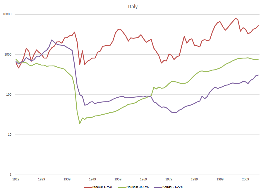
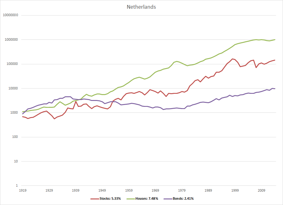
Netherlands Rates of Return
The Netherlands rate of returns map well to the study’s core conclusions: Housing investments often beat stock investments… and they deliver smoother returns.
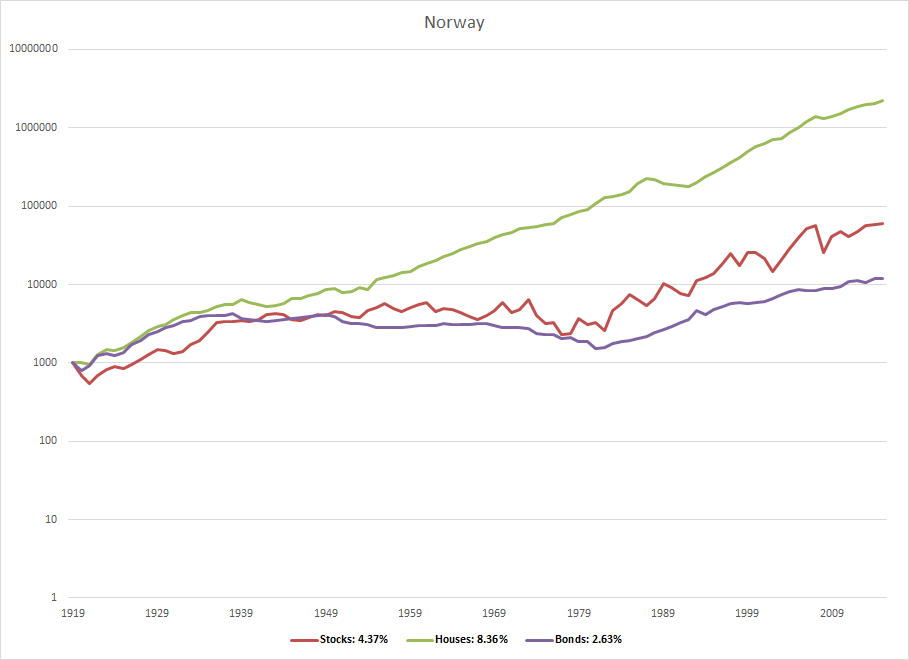
Norway Rates of Return
Norway’s rates of return history counts as yet another example of housing beating stocks. But one wonders how to or whether to factor in the effect of the country’s vast oil wealth.
Spain Rates of Return
The Spain line chart again highlights the common case of higher returns to housing. And it maybe hints at something else interesting for U.S. investors. The Spanish stock market’s returns during the 1970s seem correlated with the US stock market’s returns. (U.S. investors couldn’t diversify away their risk with Spanish stocks.)

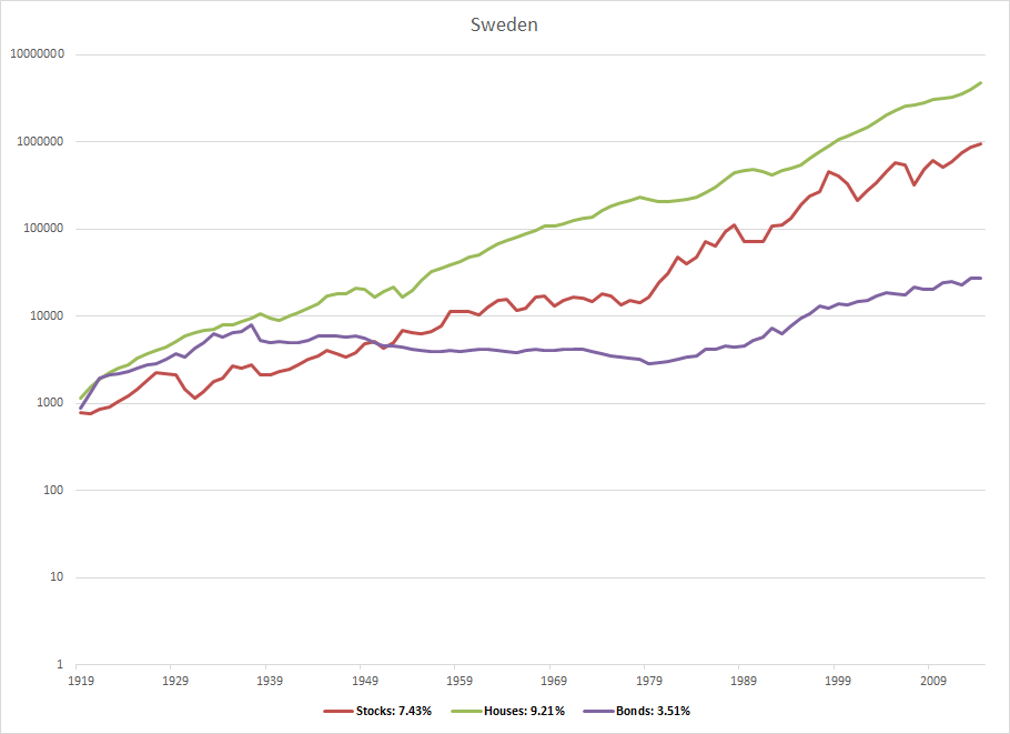
Sweden Rates of Return
Sweden again showcases the higher returns delivered by housing–9.21% for housing versus 7.43% for stocks–and then the uneven returns of stocks.
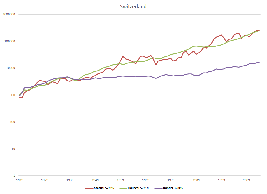
Switzerland Rates of Return
For Switzerland, stocks slightly beat housing investments: 5.98% versus 5.92%. But the jagged red line in the chart really highlights the greater volatility of stocks.
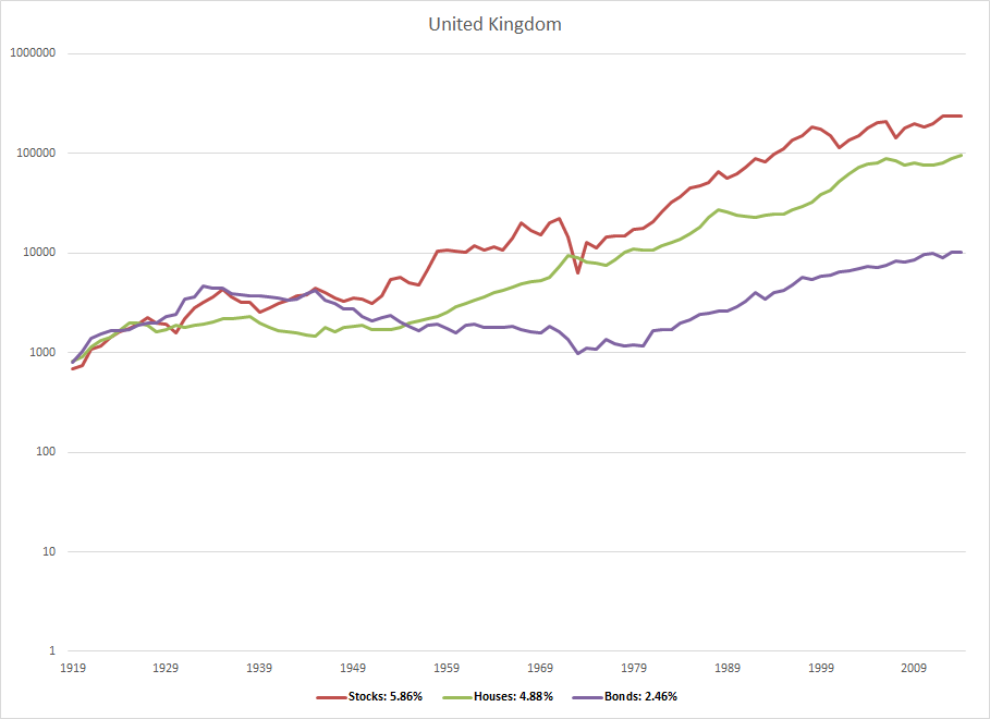
United Kingdom Rates of Return
The United Kingdom’s line chart shows stocks handily beating housing over a century–and also substantial volatility in returns. (That’s the jaggedness of the red line…) The other thing to note if you’re a retiree or someday plan to be: The UK stock market also tanked in the early 1970s meaning that its stocks would not have helped you diversify away the worst case retirement scenario in living memory: The cohort who retired in 1966. (Ben Carlson did a good write-up here on this bit of financial history.)
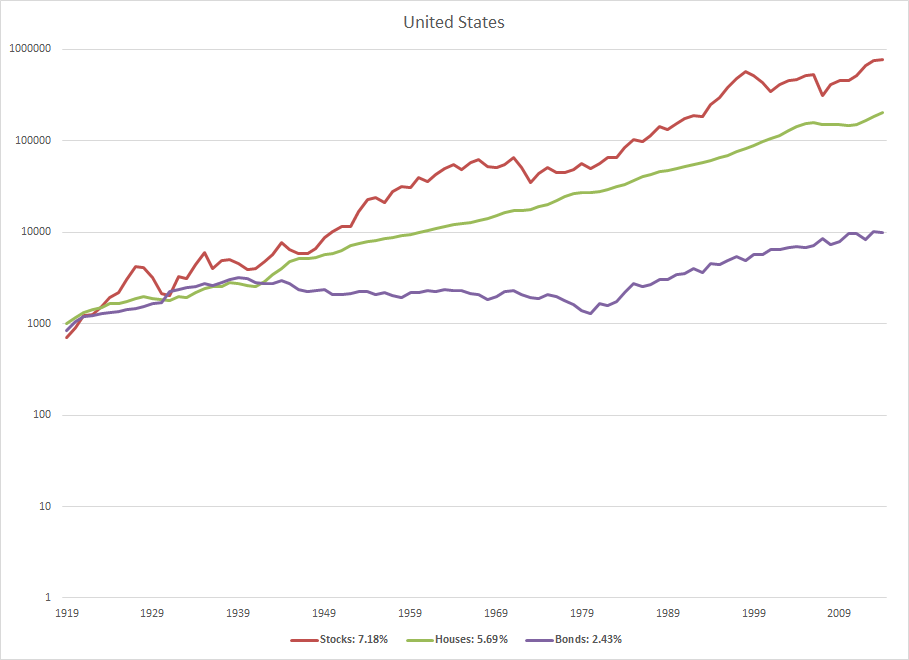
United States Rates of Return
And the last line chart of returns: The United States’… For the US, stocks beat housing. But in line with the study’s observations, stocks give investors a roller-coaster ride of returns. Also, in relationship to the 1966 scenario in the US (which happens to be worst scenario for retired US investors over the last century or so), housing would have shored up an investor’s portfolio. Apparently.
Quick Closing Comments
I’m not going to spend more space here talking more about the study. As noted, we’ve got that earlier blog post that summarizes my sense of the actionable insights. But this obvious comment: Stocks (and real estate investments too) burden investors with additional risks. Also, investing in a single country has often been a very risky practice. Investors need to stay sober and alert.
And this final comment: The very best place to dig into the details of the study is the study itself!
I wonder if the difference in housing returns can be explained by net immigration (increased demand)?
Thanks Evelyn, so yeah, I don’t know how we explain the higher returns that housing usually delivers. As noted in my first discussion of this research, the authors explicitly point to the lower variability in returns. I myself wonder if there isn’t a sort of “Heisenberg uncertainty principle” at play here… All the measuring and monitoring of publicly traded stocks results in their prices getting pushed around more. Or maybe the usual higher returns to housing simply reflect housing investments are harder to make?